Typography Tips For Authors:
Practical and Esthetic Use Of Type
The purpose of this series of articles is to provide you, the writer, with enough typographic savvy to judge the quality of design of your books. You may hesitate to question your designer, who should be a professional, of course, but sometimes improvements can be made, especially in the matter of typography. And you are the one paying the bills, right?
The suggestions I’ll be making are based on many years of book-design experience supported by information from the following texts: “The Design of Books” by Adrian Wilson, “Designing With Type” by James Craig and ”The Elements of Typographic Style” by Robert Bringhurst.
First let’s have a look at the typographic design of book covers. It might be helpful if you randomly select several books from your own collection and keep them handy for comparison when you read this.
Type Selection
Type fonts should reflect the content of the text. A bold sans-serif type is inappropriate for a book of poetry. A light-weight italic is unsuitable for a history of locomotives. These are admittedly extreme examples, but if you are dissatisfied with the first type style suggested by the designer, request a look at some other choices.
What to you think of the type styles used on your own books?
Type Placement
There are no rules for the placement of type on a book cover. But in the matter of visual balance, some arrangements are certainly more pleasing than others. I’ll leave that judgment to your aesthetic sense. But I want to mention one thing that I see too often: the placement of the title or any other printed information too close to the edges of the cover page, especially the top and bottom. What exactly is the point of crowding the edges? Occasionally a text title can be bled over or right up to the edge of a book cover for a dramatic creative effect. But more often I see it done with no such effect in mind, and I can only conclude that the designer is asleep at the wheel.
Have a look at your own books again.
Kerning: Uppercase
This is the typographic term for adjusting the space between individual letters within a word. The idea is to make the space between letters as optically consistent as the letter forms will allow. Proper kerning creates a balance between the black letter forms and the volume (but not the shape) of the white space between them. It improves legibility and is aesthetically pleasing. Here’s an example of an unkerned book title:

Proper kerning of capital letters is more difficult that lower case (small) letters because some of the letter shapes force others to keep their distance—LA, WY, TY. A better balance is often accomplished by increasing the space between the jammed-up letters. Correctly done it often works well on book titles. If it’s overdone, the words can fall apart. Here is a kerned example:

Kerning: Lowercase
Words constructed of lower-case letters seldom need much kerning, none at all on text-sized type because lower-case letters were designed to fit pretty well together in any combination. But even when extra space is placed between letters, as I see on many book covers, the words still need proper kerning. On large-size lower-case type with normal letter spacing, a little bit of kerning may be helpful, too. The top example below demonstrates the difference between a title with no attention paid to kerning:
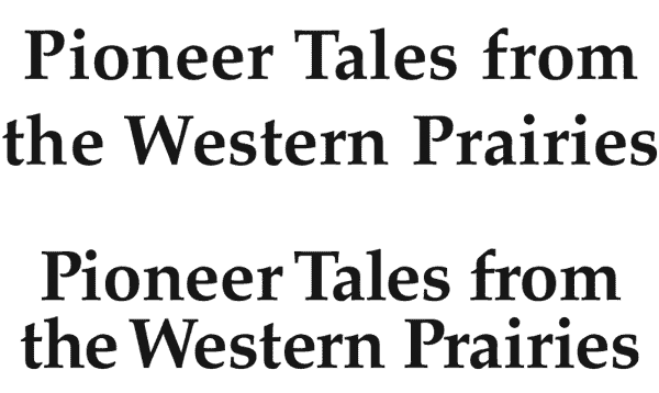
Remember: kerning for word balance and improved legibility is neither difficult nor expensive. Why not have it done right?
How would you rate the kerning on your own book covers?
Word Spacing
The space between words on a line of type is important because it can contribute to or inhibit the horizontal flow of words. The words must be separated enough to maintain their identity but close enough to maintain an even flow. There are some mechanical guides for word spacing display (large) type, but basically it’s an eyeball judgment. In my opinion the most common error made on book covers is spacing words too far apart.
What do you think of your book covers in the matter of word spacing?
Leading
This is a term used to measure the vertical space between lines of type, a holdover word from a time when the method of increasing that space was to insert a strip of lead between the lines. A writer doesn’t need to know any more than that, but should understand what the word means.
Typographic Design on Book Covers
There are seldom many lines of type on a book cover although a long title usually requires a stack of words. Their vertical proximity is worthy of attention. Some covers are designed with a lot of leading between the lines of type. Sometimes that works well. But other times the leading is so excessive it makes the whole typographic unit fall apart. Common sense dictates that a person should be able to read book title smoothly, without hesitating between the lines.
What is amazing to me is to see a cover where the space between the top of the cover and the first line of the title is less than the leading between the lines of type below. Why lead out the title and then jam the top line of the title up toward the trim edge? It would appear then that the top words have a cozier relationship with the edge of the cover than they do with the words below them. I see this sort of thing a lot. And I think it's a bad idea.
How’s the leading on your book covers?
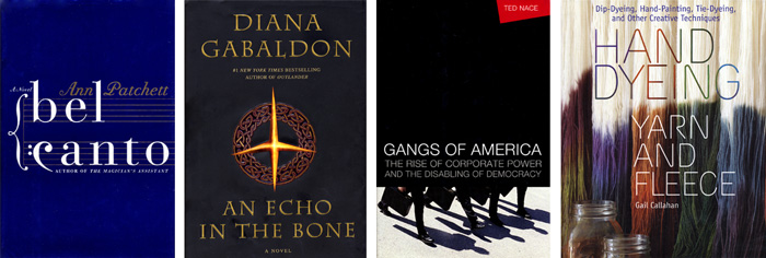
Examples
Here are a sampling of covers I admire for their typography: "Bel Canto" by Ann Patchett, designed by Roberto De Vicq de Cumtich, "An Echo In The Bone" by Diana Gabaldon, designed by Marietta Amastassatos, “Gangs of America” by Ted Nace, designer not identified, and “Hand Dyeing Yarn and Fleece" by Gail Callahan, designed by Mary Winkelman Velgos.
Your comments and questions are welcome.
Robert Jacobson email